Indesign Tutorials
Logo Design
I chose to design a logo for Green Acres Landscaping. I chose to use only three bright colors in the design of my logo. I believe my logo is easy to see and recognize at a glance and the logo is not too cluttered. The font I used uses all capital letters, which makes the name easier to read. I believe my logo would appeal to customers of a landscaping company because they would like to see their grass be green on a bright, sunny day. I used simple 2-D imagery because when you put too much detail into a logo, it starts to look cluttered and would not look good in a small size. A great thing about my minimal use of text is that once the logo was recognizable enough, the text could be easily taken away and people would still know what company the logo was for. My logo contains bold colors that look just as good in black and white. Overall I believe my logo communicates the business well and would appeal to many people.
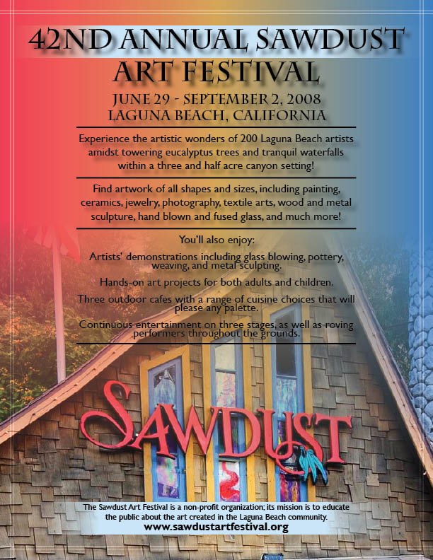
Sawdust Art Festival Ad
 (Click image for full-size)
I chose the main image on the page to be one of the buildings with the Sawdust logo on it. I chose this image because it is an important building for the festival. It serves as the entrance to the festival. Also, putting the actual logo on the flyer helps people recognize what the flyer is about quicker. The gradient I used in the background contains three colors that make up the sawdust festival logo in my image. This gradient helps pull all the elements together. I made the sawdust festival test the largest on the page because that is the main idea of the flyer. The rest of the text is a bit smaller, but still large enough to read from far away or through a store window, etc. The website and non-profit information was put at the bottom of the flyer to help bring focus to all parts of the flyer. Finally, I put a small, opaque double-line border around the entire flyer. I believe this add a nice element to the flyer and makes it feel more complete.
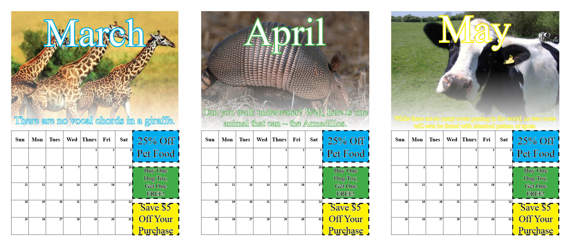
Humane Society Calendar
 (Click image for full-size)
I chose a simple, traditional layout for my calendar. I did not want too much on the page because it would look overcrowded. The picture of the animal is the largest element on the page because it catches your eye and gives you something interesting to look at while the calendar is hanging up. The month is large on each page so you can easily see what month the calendar is for. I put a stroke around all of the text so it would pop from the page and would not get lost in the image. The coupons have a dashed stroke around them so you know that they are coupons and can be cut out. The interesting animal facts are in the middle of the page to help guide your eyes towards the bottom. I chose the simple font and color scheme because a calendar should not be too crazy. It is simply to keep important dates in mind and having too many elements on the page would take away from the main purpose of the calendar.
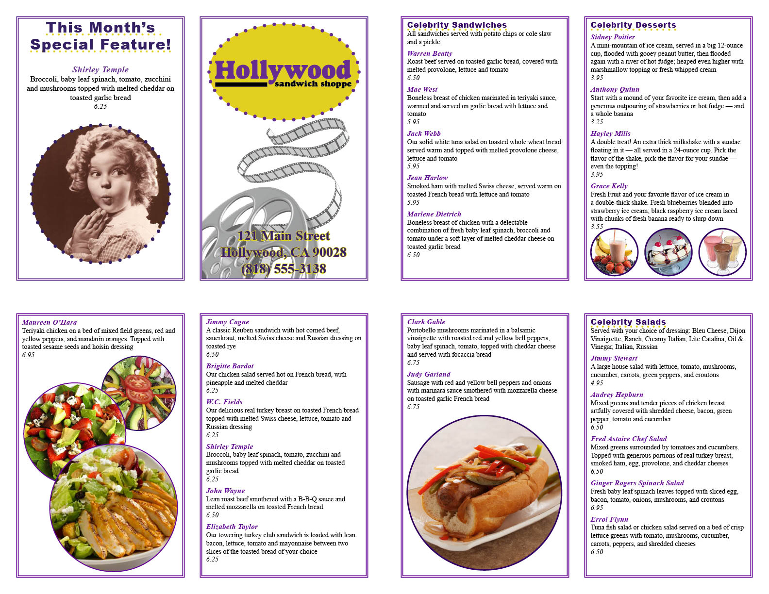
Hollywood Sandwich Shoppe Menu
 (Click image for full-size)
I tried to give my Hollywood menu layout an old, 1950s diner feel. I used a color scheme of purple and yellow as a basis for my menu design. I used the purple because the Hollywood Sandwich Shoppe logo is two different shades of purple, and I thought the yellow was a nice contrasting color to the purple. I used a simple, easy to read font so that there would not be any confusion with what was on the menu. The film reel on the front cover helps relay the theme of a Hollywood diner where all of the menu items are named after a famous Hollywood star. I used circles as the main shape of the menu. I think it helped to break up the boxy feel a menu usually has. The pictures I used throughout the menu make the food look inviting and delicious. I went with a double fold menu instead of a triple fold menu because it allowed me to use a larger font throughout the menu. While my menu is simple, I think it does a good job of presenting the menu and does not over complicate the design of the menu. The simplicity of the menu allows for an easy change month to month as the client requested. The colors, fonts, and pictures can all be easily modified to give the menu a completely new feeling each month.